

Blogger yang dikenal dengan Blog statis, yaitu proses HTML yang baku dan tidak bisa diubah-ubah, berbeda dengan Blog dinamis yang dikenal dengan nama 'website' mempunyai proses interaktif, artinya mempunyai fitur yang dapat dimodifikasi secara keseluruhan baik style, database dan layanan.
Kembali kepada Blogspot bersifat statis. Teknik ini biasa digunakan pada website, namun dengan kreatifitas Bloggers Mania, sehingga Blog terlihat modis layaknya website, diantaranya dengan membuat animasi loading page pada Blog.
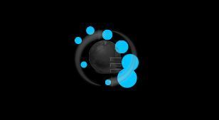
Pembuatan animasi loading page di Blogspot ini menggunakan Jquery. Nah, untuk cara pemasangannya loading page di Blog sobat, silahkan ikuti langkah-langkah berikut ini:
1. Pastikan sobat sudah login pada akun Blogger,
2. Di halaman Dasbor, beralih ke Template,
3. Klik Edit HTML,
4. Cari kode ]]></b:skin> dengan menekan Ctrl + F pada kolom Edit HTML kemudian
letakan kode berikut ini di atas ]]></b:skin>.
2. Di halaman Dasbor, beralih ke Template,
3. Klik Edit HTML,
4. Cari kode ]]></b:skin> dengan menekan Ctrl + F pada kolom Edit HTML kemudian
letakan kode berikut ini di atas ]]></b:skin>.
/* X-Gen Loader */
#xgenloader-screen {z-index:999999;background:#000;width:100%;height:100%;position:fixed !important;position:absolute;top:0;right:0;bottom:0;left:0;text-shadow:none;}
#circular3dG{
position:relative;
width:100px;
height:100px;margin:10% auto;
}
.circular3dG{
position:absolute;
background-color:#00C4FF;
width:28px;
height:28px;
-moz-border-radius:30px;
-moz-animation-name:bounce_circular3dG;
-moz-animation-duration:0.48s;
-moz-animation-iteration-count:infinite;
-moz-animation-direction:linear;
-webkit-border-radius:30px;
-webkit-animation-name:bounce_circular3dG;
-webkit-animation-duration:0.48s;
-webkit-animation-iteration-count:infinite;
-webkit-animation-direction:linear;
-ms-border-radius:30px;
-ms-animation-name:bounce_circular3dG;
-ms-animation-duration:0.48s;
-ms-animation-iteration-count:infinite;
-ms-animation-direction:linear;
-o-border-radius:30px;
-o-animation-name:bounce_circular3dG;
-o-animation-duration:0.48s;
-o-animation-iteration-count:infinite;
-o-animation-direction:linear;
border-radius:30px;
animation-name:bounce_circular3dG;
animation-duration:0.48s;
animation-iteration-count:infinite;
animation-direction:linear;
}
#circular3d_1G{
left:41px;
top:6px;
-moz-animation-delay:0.18s;
-webkit-animation-delay:0.18s;
-ms-animation-delay:0.18s;
-o-animation-delay:0.18s;
animation-delay:0.18s;
}
#circular3d_2G{
left:61px;
top:23px;
-moz-animation-delay:0.24s;
-webkit-animation-delay:0.24s;
-ms-animation-delay:0.24s;
-o-animation-delay:0.24s;
animation-delay:0.24s;
}
#circular3d_3G{
left:73px;
top:45px;
-moz-animation-delay:0.3s;
-webkit-animation-delay:0.3s;
-ms-animation-delay:0.3s;
-o-animation-delay:0.3s;
animation-delay:0.3s;
}
#circular3d_4G{
left:69px;
top:67px;
-moz-animation-delay:0.36s;
-webkit-animation-delay:0.36s;
-ms-animation-delay:0.36s;
-o-animation-delay:0.36s;
animation-delay:0.36s;
}
#circular3d_5G{
left:42px;
top:73px;
-moz-animation-delay:0.42000000000000004s;
-webkit-animation-delay:0.42000000000000004s;
-ms-animation-delay:0.42000000000000004s;
-o-animation-delay:0.42000000000000004s;
animation-delay:0.42000000000000004s;
}
#circular3d_6G{
left:8px;
top:48px;
-moz-animation-delay:0.48s;
-webkit-animation-delay:0.48s;
-ms-animation-delay:0.48s;
-o-animation-delay:0.48s;
animation-delay:0.48s;
}
#circular3d_7G{
left:0px;
top:14px;
-moz-animation-delay:0.5399999999999999s;
-webkit-animation-delay:0.5399999999999999s;
-ms-animation-delay:0.5399999999999999s;
-o-animation-delay:0.5399999999999999s;
animation-delay:0.5399999999999999s;
}
#circular3d_8G{
left:17px;
top:0px;
-moz-animation-delay:0.6s;
-webkit-animation-delay:0.6s;
-ms-animation-delay:0.6s;
-o-animation-delay:0.6s;
animation-delay:0.6s;
}
@-moz-keyframes bounce_circular3dG{
0%{
-moz-transform:scale(1)}
100%{
-moz-transform:scale(.3)}
}
@-webkit-keyframes bounce_circular3dG{
0%{
-webkit-transform:scale(1)}
100%{
-webkit-transform:scale(.3)}
}
@-ms-keyframes bounce_circular3dG{
0%{
-ms-transform:scale(1)}
100%{
-ms-transform:scale(.3)}
}
@-o-keyframes bounce_circular3dG{
0%{
-o-transform:scale(1)}
100%{
-o-transform:scale(.3)}
}
@keyframes bounce_circular3dG{
0%{
transform:scale(1)}
100%{
transform:scale(.3)}
}
5. Setelah itu cari kode </head> dan letakan kode berikut diatasnya,
<script src='http://ajax.googleapis.com/ajax/libs/jquery/1.8.3/jquery.min.js' type='text/javascript'/>
Jika telah ada sebelumnya Jquery di atas pada template blog, lewati langkah ini.
6. Kemudan cari kode </body> dan letakkan kode berikut ini diatasnya,
<!-- Start Andi-Techno.blogspot.com Loader -->
<script type='text/javascript'>
//<![CDATA[
$(function() {
setTimeout(function() {
$('#xgenloader-screen').fadeOut();
}, 5000);
});
//]]>
</script>
<div id='xgenloader-screen'><div id="circular3dG">
<div id="circular3d_1G" class="circular3dG">
</div>
<div id="circular3d_2G" class="circular3dG">
</div>
<div id="circular3d_3G" class="circular3dG">
</div>
<div id="circular3d_4G" class="circular3dG">
</div>
<div id="circular3d_5G" class="circular3dG">
</div>
<div id="circular3d_6G" class="circular3dG">
</div>
<div id="circular3d_7G" class="circular3dG">
</div>
<div id="circular3d_8G" class="circular3dG">
</div>
</div>
</div>
<!-- End Loader -->
7. Klik Simpan Template. Jika sudah benar melakukan semua tahap di atas, sekarang sobat lihat hasilnya.
Semoga bermanfaat
Semoga bermanfaat
thank to sumber
Anda sedang membaca artikel tentang Membuat Loading Animasi Blogspot Mirip Startup Windows 8. Anda bisa bookmark halaman ini dengan URL http://jejak-blogku.blogspot.com/2013/07/membuat-loading-animasi-blogspot-mirip.html.
Jika Anda menyukai Artikel di blog ini, Silakan masukkan email Anda di bawah ini untuk berlangganan gratis via email, dengan begitu Anda akan mendapat kiriman artikel setiap ada artikel yang terbit.

|
Rating: 4
Reviewer: Aditya Agus N
ItemReviewed: Membuat Loading Animasi Blogspot Mirip Startup Windows 8


0 komentar "Membuat Loading Animasi Blogspot Mirip Startup Windows 8", Baca atau Masukkan Komentar
Posting Komentar